How a Great Plains ecotourism poster is made
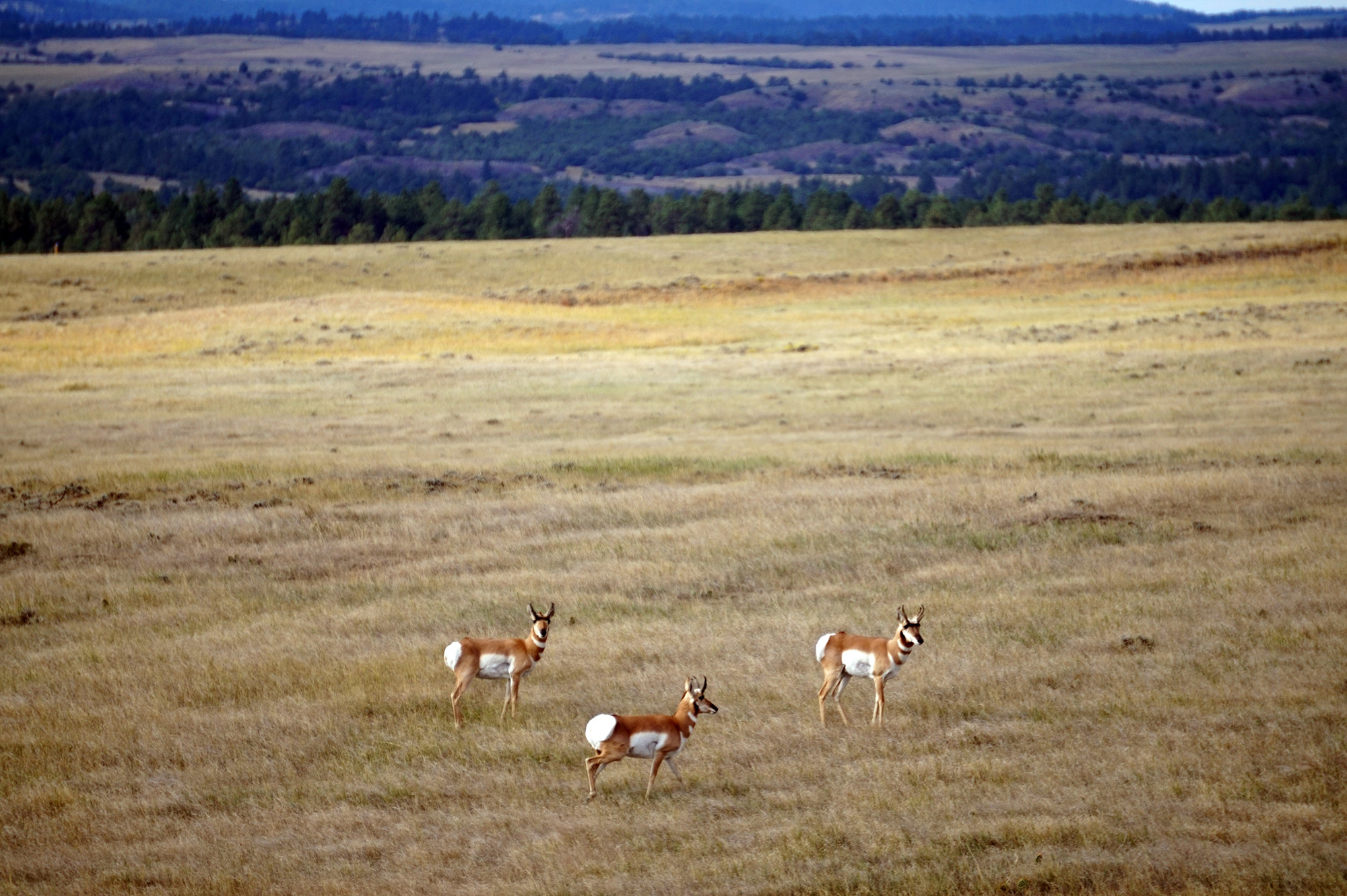
Photo by Daniel Clausen
By Katie Nieland, Center for Great Plains Studies
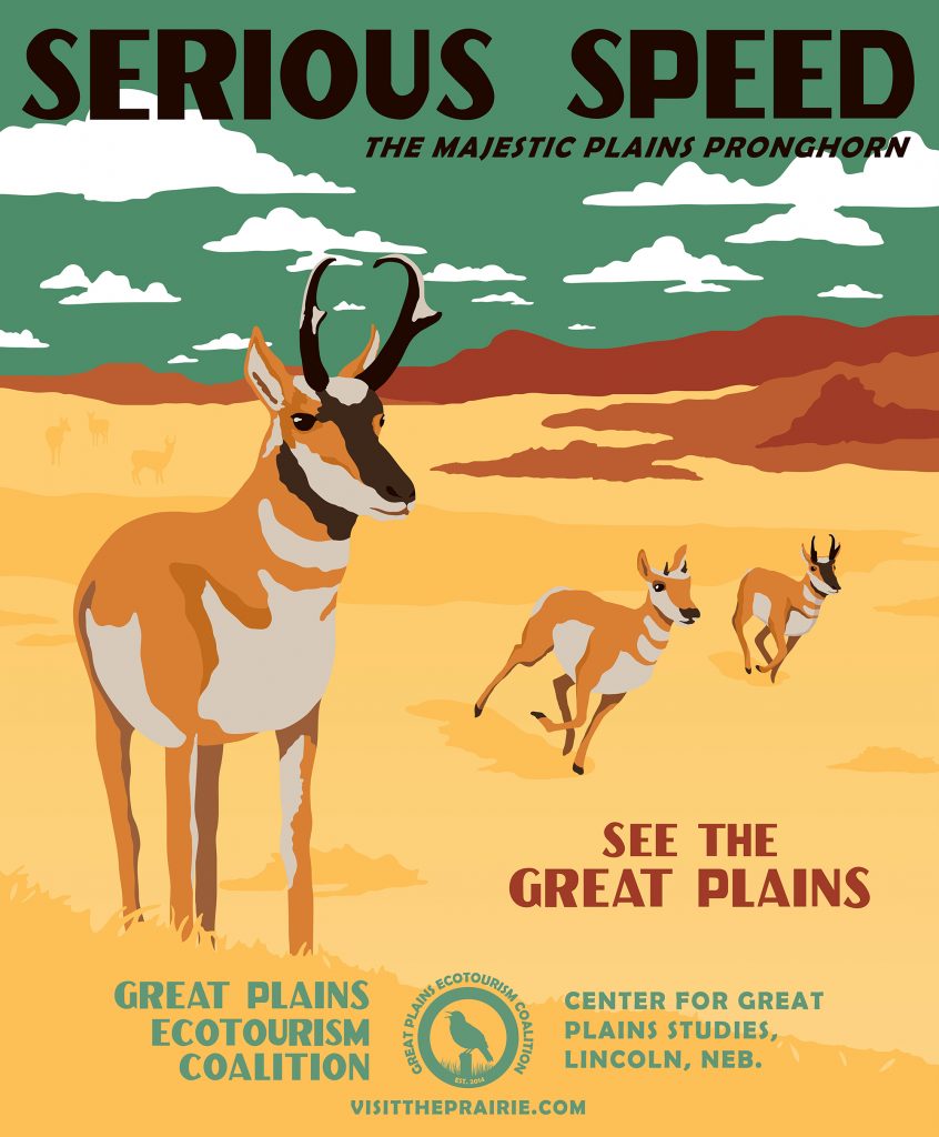
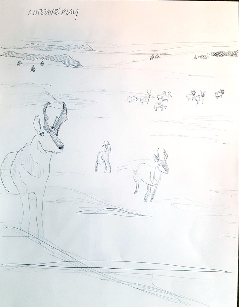
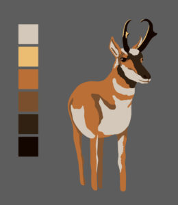
For this month’s feature, I thought I’d share a behind-the-scenes look at how I made one of the now widely traveled ecotourism posters. I’ll go step by step for the most recently printed poster, the pronghorn. It starts with some sample images of the subject, like the ones above, which I used to help get the animal silhouette and markings right. Then I make a couple layout sketches. They turn into a final sketch, like the one below. You’ll notice I labeled it “Antelope Play” – which was an early title for the poster. We ultimately changed it to “Serious Speed” because, as many of you know, pronghorn are not true antelopes and I didn’t want to confuse anyone.
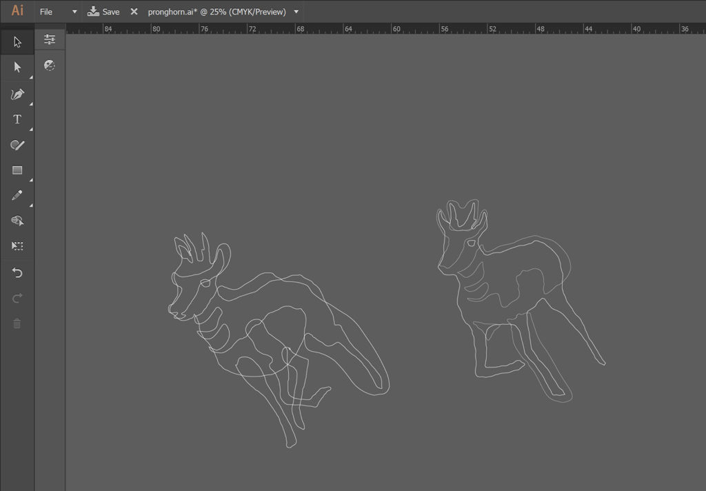
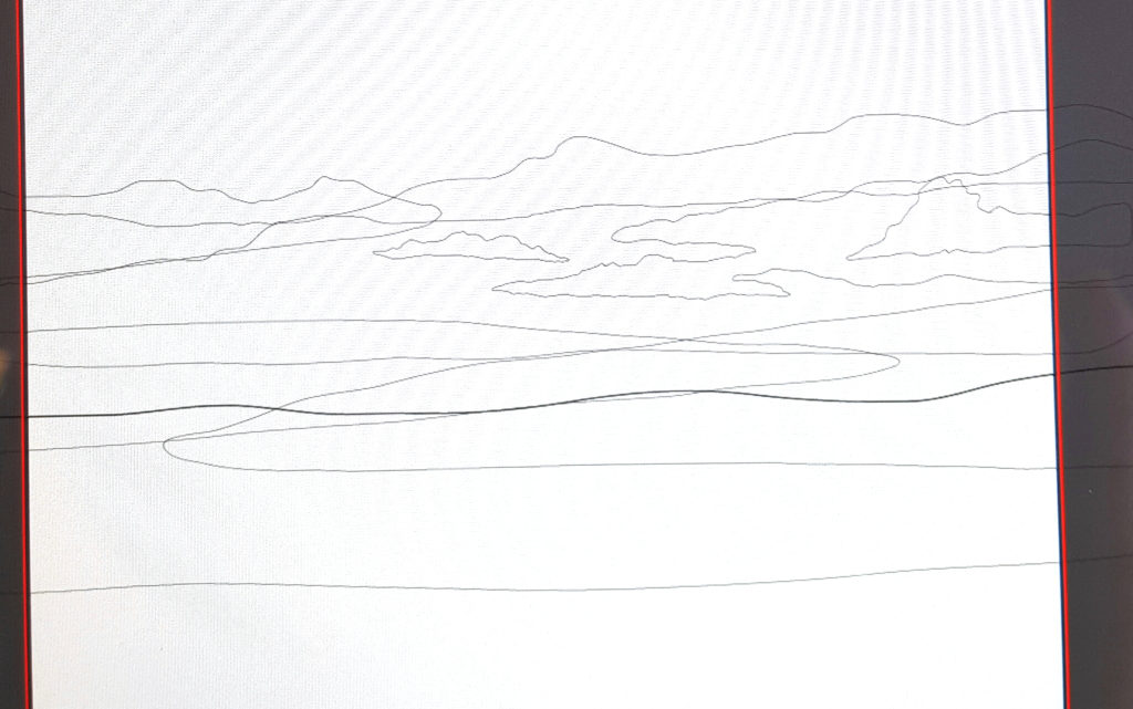
Then I head to my tablet, where I use a pen to make some wire frames (below) that I’ll fill in later with color. There’s a main outline, then there are color blocks. I use the main outline to cut away the color block excess.
I also do the same thing for the background.
I use a limited range of colors to give the posters the look of the original WPA National Parks posters from the 1930s-40s. I try to balance the poster set so there are generally an even number of warm- and cool-colored posters.
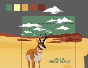
The top line of text is hand drawn from the original WPA posters. Here’s the final product: